
For various reasons, brands update their logos and change font styles to make them more visible on digital platforms such as social media, website and Smartphone apps. As a result, nowadays, brands love using Serif font because they come in a wide variety and can be easily identifiable in small sizes and it looks much better on any browser and low-resolution digital devices. Serif fonts are easy to read, and they easily convey the message without being too concerned about the font itself. Some are also classy and seem more formal than sans serif font.
Serif Font History
Sans serif originates from Italian and Italian type designers, Domenico Olduino and Francesco Griffo. These typefaces for the past 500 years are often used in print media. They are also used by many publishing companies, like The New York Times or the Washington Post.
The words serif and sans are often related to the designs of fonts. Sans means “without,” but it is also the French word for “without” or “not.” Serif, on the other hand, is derived from French and means “little foot” or “leg,” but it’s also the name of a letter when referring to the letter f (one of the commonest letters). The serifs stem from the letter f and have been used in print media for many centuries.
What Is a Serif Font?
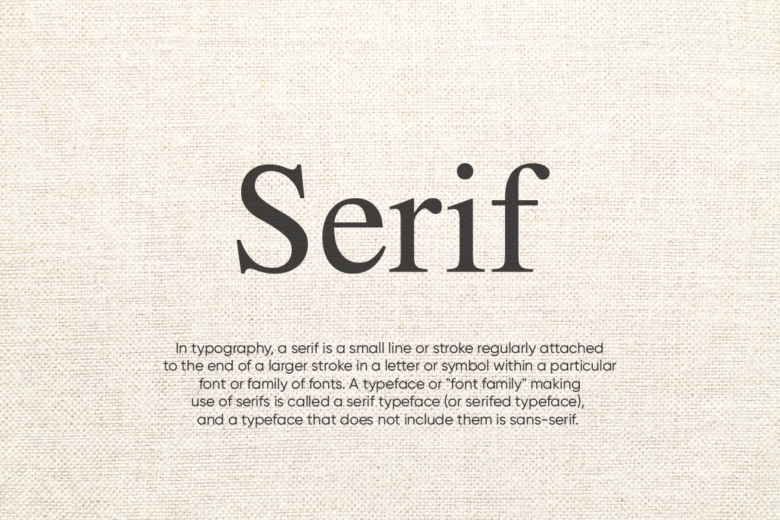
Serif font is a type of text that includes small lines on the edges of each letter. Serif fonts are often used for body copy because they render well on low-resolution screens and prints.
Any typestyle with serifs is referred to as “serif fonts” and has been widely used for a long time.
Serif typefaces have long been acknowledged for improving the readability and reading speed of long phrases and sentences by easing the eye movement across a line, especially when lines are long or word spacing is relatively open, as with some justified type.
Professional tip: A serif font is often part of a logo, so if you’re planning to make a logo for your brand, you should consider using a serif font.
Classification:
1. Old-style
The lack of considerable contrasts between thick and thin lines (poor line contrast) and, more rarely, diagonal stress describe the old-style type (the thinnest parts of letters are at an angle rather than at the top and bottom). This old-style font usually has a left-inclining curve axis with weight stress at about 8 and 2 o’clock.
2. Transitional
Transitional, or baroque, serif typefaces were popular from the mid-eighteenth century throughout the beginning of the nineteenth.
The word “transitional” comes from the fact that they are halfway between “old style” and “modern” typefaces. The variations between thick and thin lines are more pronounced than old-style but not as striking as Didone fonts.
3. Didone
Didone, or modern serif typefaces, initially appeared in the late 1800s and are distinguished by a sharp contrast between thick and thin lines. Vertical stress and narrow serifs with a consistent width, with minimum bracketing, and the vertical lines are usually very heavy, and serifs are very thin. Didone fonts are usually less readable than transitional or old-style serif fonts.
4. Slab Serif
Slab serif fonts have been used since 1817. They have exceptionally thick serifs, often as thick as the vertical lines themselves, and were originally designed as attention-getting designs for posters. Slab serif fonts come in various shapes and sizes; some have a geometric style with no variation in stroke width; they’re frequently referred to as sans-serif fonts with serifs. Slab serif styles are usually applied for posters and small print because of the clear, bold character of the big serifs.
What Is a Sans Serif Font?
The typestyle without “serif” is San Serif; it has had less stroke width variation than serif typefaces.
San Serif fonts are frequently utilized to convey modernity and minimalism. It has become the top choice typeface as it looks much better on displays or computer screens, even on low-resolution digital devices. This font is regularly used for display use and less for body text.
What Is the Difference Between Serif and Sans-Serif Fonts?
It’s all about the little details at the ends of strokes!
Fonts with serifs are referred to as “Serif fonts,” a decorative stroke that ends the end of a letter’s stem (also known as the letter’s “feet”). On the other hand, “San-Serif Fonts” don’t have serifs.
Times New Roman, Garamond, and Georgia are examples of popular serif types. Arial, Futura, and Helvetica are examples of popular sans-serif fonts. Print publications, such as books and newspapers, frequently employ serif typefaces, but digital publications and magazines use sans-serif fonts.
When clarity and legibility are important, a sans-serif font is fantastic for headings and small text. Serif fonts are ideal for huge blocks of printed text, such as on a flyer.
Reasons To Choose Serif Fonts
Serif fonts are considered to be more formal than sans serif fonts. They have a greater contrast between thick and thin strokes. Serif texts are ideal for print publications such as books, magazines, and newspapers with their greater contrast.
Some serif fonts even come with varying widths (slab serifs), which helps readablefor certain characters.
- Modern utility
Serif fonts have been around for centuries. Visually and historically, they have traditional connotations and modern utility in that they are more readable. It is also suitable for various media as it is clear and more legible to match modern trends.
- Readability
It has been scientifically proven that it is easier for the brain to separate characters from the background. Because when there are some serifs on the edge of each character, it helps the brain to separate and read.
Optical illusions and other scientific evidence also suggest that serifs make letters simpler to read by creating white space and reducing clutter and noise in small types.
- Simplification
Because serif fonts are easier to read and are easier for the brain to process, serif fonts often make text simpler. As a result, startups to established brands considering Serif font to attract with simplicity.
- Tactile
Serifs have an interesting history in print design: they were originally used as a way to make the printed text “feel” more like handwriting. Serifs give a bit of texture to letters and make them more appealing than they might otherwise be.
- Brand Recognition
In modern branding, recognition is a great thing to have.
Serif fonts are recognizable and familiar, and they “feel” more like a product or organization than sans-serif fonts. It’s often easier to associate serif fonts with a brand or product when compared to their sans-serif counterparts, who may not necessarily be as well-known.
Conclusion
Different fonts have pros and cons, so all choices should make carefully!
Many typefaces are available in a wide range of font families designed by several designers in the 20th and 21st centuries. Each designer has its style, look, and personality. Most designers work behind the scenes to reproduce their styles on their typefaces. Occasionally one designer will directly contact a foundry to get their typeface released as a font.
However, choosing a serif font that fits your design is very easy. The only thing is to select a font family that you like and try it out. It doesn’t matter if it is a light, regular or bold weight of the same typeface. Try it out and see how it looks on your design comp and mockup designs.
Need assistance in logo design or playing with fonts in graphic designing? Devgraphix can be your ally. Reach us @ [email protected] to get a quote!